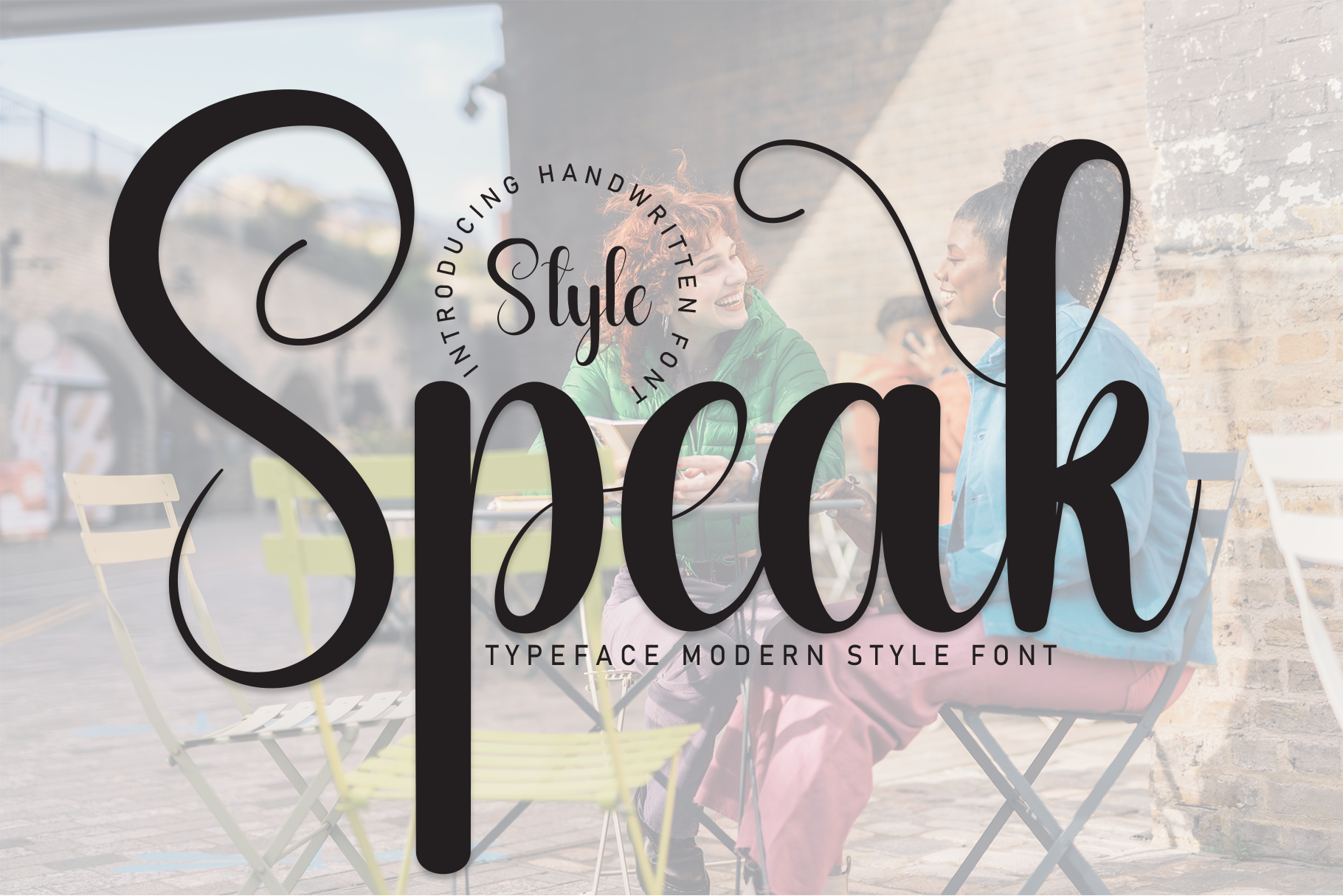
In the crowded aisles of a supermarket, amidst a cacophony of colors and logos, what makes a product stand out? Often, it’s the silent whisper of a well-chosen font, an unsung hero of packaging design that speaks volumes before a word is even spoken. But fonts in packaging aren’t simply visual ornaments; they’re strategic partners, crafting the first impression, shaping brand identity, and ultimately influencing buying decisions. So, let’s delve into the art of wielding fonts as powerful tools for creating packaging that stands out, lingers in the mind, and whispers the right story to the right audience.
First Impressions are Font Impressions: Setting the Tone in a Split Second
Imagine browsing shelves crammed with products, each vying for your attention. A playful, bouncy script might draw you to a children’s cereal, while a bold, assertive sans-serif might command your gaze towards a premium coffee blend. Fonts set the initial tone, establishing the product’s character and target audience before you even touch the packaging. They can whisper luxury, scream fun, or exude a rustic charm, all within the blink of an eye. Choose wisely, for the first impression crafted by your fonts style choice can make or break the journey towards a purchase.
Beyond Aesthetics: Crafting Brand Identity with Every Curve and Angle
Think of your brand as a personality, with its own unique quirks and aspirations. Fonts, then, become the visual language that gives voice to this personality. A classic serif font might embody heritage and tradition, while a sleek, modern sans-serif might speak of innovation and cutting-edge technology. Every curve and angle of a chosen font becomes a brushstroke in the larger canvas of your brand identity, ensuring consistency and recognition across all packaging elements. Remember, fonts aren’t merely cosmetic choices; they’re the building blocks of a brand’s visual language, whispering its essence to every potential customer.
More Than Words: Guiding Attention and Storytelling Through Typography
Packaging speaks not just through overt logos and taglines, but also through the subtle dance of typography. Use font size and weight to direct the viewer’s eye, highlighting key information like product names or essential benefits. Experiment with text placement and layout to create a sense of hierarchy and narrative flow. Imagine a vibrant salsa jar where the bold product name dominates, followed by a smaller, playful description in a contrasting font, hinting at the flavor journey within. Remember, fonts become visual guides, leading the customer through the story your packaging tells, even before they crack open the seal.
Emotional Resonance: Evoking Feelings with the Language of Letterforms
Fonts whisper not just information, but also emotions. A delicate script might evoke a sense of elegance and sophistication, while a chunky, hand-drawn font might radiate warmth and authenticity. Choose fonts that resonate with the emotions you want your product to evoke. Imagine a comforting herbal tea box adorned with a soft, rounded script, promising tranquility and inner peace. Remember, fonts are emotional catalysts, weaving invisible threads that connect with the customer’s inner landscape and influence their perception of your product.
Cultural Nuances: Speaking the Language of Your Audience
The power of fonts transcends borders and demographics. Understanding and respecting cultural nuances in typography is crucial for global market success. Certain fonts might carry specific connotations in different cultures, and failing to recognize these associations can inadvertently send the wrong message. In China, for instance, red signifies luck and prosperity, while in the West, it might be associated with danger or negativity. Research your target audience’s cultural context, ensuring your font choices resonate with their expectations and avoid unintentional offence.
Beyond Paper and Boxes: Expanding the Canvas of Typographic Storytelling
The realm of packaging design isn’t confined to static cardboard boxes. With the rise of digital and interactive experiences, fonts are increasingly taking center stage in augmented reality displays, personalized labels, and even interactive packaging elements. Embrace this evolving landscape, experimenting with dynamic fonts that change with lighting or user interaction, creating a truly immersive brand experience. Remember, the canvas for your typographic magic is no longer limited to paper; it’s the entire customer journey, waiting to be infused with the power of storytelling through fonts.
In conclusion, fonts in packaging design are not mere aesthetic afterthoughts; they are strategic partners in the quest to capture attention, build brand identity, and ultimately, connect with consumers on an emotional level. By understanding the power of first impressions, leveraging fonts to tell your brand story, and embracing the evolving canvas of packaging design, you can transform your product from a nameless, faceless entity into a voice that whispers, entices, and ultimately wins the hearts of your customers.


